SVG Filters
Jakob Jenkov |
SVG filters are used to add nice effects to your SVG images. For instance, drop shadow, blur or highlights.
Filter Example
Here is a simple SVG filter example that shows two ellipses. The left ellipse is displayed without a filter. The righ ellipse is rendered with a Gaussian Blur filter applied to it:
  <defs>
      <filter id="blurFilter" y="-5" height="40"
          <feGaussianBlur in="SourceGraphic" stdDeviation="3" y="-"/>
      </filter>
  </defs>

  <ellipse cx="55" cy="60" rx="25" ry="15"
           style="stroke: none; fill: #0000ff; " />

  <ellipse cx="155" cy="60" rx="25" ry="15"
           style="stroke: none; fill: #0000ff; filter: url(#blurFilter);" />
Here is the resulting image:
Notice how the edge of the right ellipse is blurred.
Filter Input and Output
SVG filters takes some input (source) to which they apply their filter effect. The input of a filter can be either the graphic of a shape (meaning the RGB colors), the alpha channel of a shape, or the output of another filter.
SVG filters produce a graphic output (result) from the input. This output is what is normally displayed instead of the shape the filter is applied to. The output of a filter can be used as the input of another filter. Thus, filters can be chained.
Here is an illustration of SVG filter input and output:
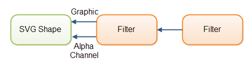 |
| SVG filters can take a shape graphic, alpha channel or the output of another filter as input. |
The input of an SVG filter is normally specified in the in attribute of a filter element.
Here is an example:
<feGaussianBlur stdDeviation="3" in="SourceGraphic" />
If the output of an SVG filter is to be used as the input of another filter, you need to add
a result attribute to the filter element. Here is an example:
<feGaussianBlur stdDeviation="3"
    in="SourceGraphic" result="blur"/>
Another SVG filter can now use the output of this filter by putting the value blur
into its in attribute. The value blur is specified in the result
attribute of the filter in the example above.
Filter Dimensions
The dimensions of a filter are set using its x, y, width
and height attributes.
The x and y attributes are interpreted
relatively to the x and y of the shape used as input. Since the output of
some filters are often bigger in size than the input (like blur added around a shape), you will often
need to use a negative number for x and y to avoid cutting off the graphics
added by the filter.
The width and height attributes are equally straightforward. Again, you may
sometimes have to specify a width and height that is larger than the input shape, to avoid cutting off
effects added by the filter.
Combining Filters
You can combine filters using the <feMerge> element.
Here is an example:
<defs>
    <filter id="blurFilter2" y="-10" height="40" x="-10" width="150">
        <feOffset in="SourceAlpha" dx="3" dy="3" result="offset2" />
        <feGaussianBlur in="offset2" stdDeviation="3"  result="blur2"/>

        <feMerge>
            <feMergeNode in="blur2" />
            <feMergeNode in="SourceGraphic" />
        </feMerge>
    </filter>
</defs>

<ellipse cx="55" cy="60" rx="25" ry="15"
         style="stroke: none; fill: #0000ff; filter: url(#blurFilter2);" />
This example creates an SVG filter containing two filter elements:
<feOffset> and <feGaussianBlur>. The offset
filter effect works on the alpha channel of the shape it is applied to. The
Gaussian blur works on output from the offset filter effect.
The <feMerge> element combines the output of the blur filter
with the original graphic. The inputs are combined in the order they appear
inside the <feMerge> element. Thus, the later inputs are shown ontop
of earlier inputs. The result is an image where the shape looks like it
has a drop shadow. Here is the resulting image:
Gaussian Blur Filter
The Gaussian blur SVG filter can blur an SVG shape. The Gaussian blur filter is
represented by the <feGaussianBlur> element. Here is an example:
<defs>
    <filter id="blurFilter4" x="-20" y="-20" width="200" height="200">
        <feGaussianBlur in="SourceGraphic" stdDeviation="10" />
    </filter>
</defs>
<rect x="20" y="20" width="90" height="90"
      style="stroke: none; fill: #00ff00; filter: url(#blurFilter4);" />
This example defines a <filter> with a <feGaussianblur>
inside. The example then defines a green rectangle which references the filter from its
CSS filter property. Here is the resulting image:
Blur Size
The stdDeviation attribrute of the <feGaussianBlur>
element determines how much to blur the shape the filter is applied to. The bigger
a number, the more the shape is blurred. Here are three examples with different
values for the stdDeviation attribute:
<defs>
    <filter id="blurFilter5" x="-20" y="-20" width="200" height="200">
        <feGaussianBlur in="SourceGraphic" stdDeviation="2" />
    </filter>
    <filter id="blurFilter6" x="-20" y="-20" width="200" height="200">
        <feGaussianBlur in="SourceGraphic" stdDeviation="6" />
    </filter>
    <filter id="blurFilter7" x="-20" y="-20" width="200" height="200">
        <feGaussianBlur in="SourceGraphic" stdDeviation="12" />
    </filter>
</defs>

<rect x="20" y="24" width="90" height="90"
      style="stroke: none; fill: #00ff00; filter: url(#blurFilter5);" />
<rect x="150" y="24" width="90" height="90"
      style="stroke: none; fill: #00ff00; filter: url(#blurFilter6);" />
<rect x="300" y="24" width="90" height="90"
      style="stroke: none; fill: #00ff00; filter: url(#blurFilter7);" />
Here is the resulting image:
Notice how the rectangles become more and more
blurred, the higher the value in the stdDeviation attribute of
the filter applied to them is.
Blurring the Alpha Channel
The example above used SourceGraphic as input, meaning the RGB
colors of the shape were used as input for the filter. You can use the alpha
channel of the shape as input instead, by setting the value SourceAlpha
on the in attribute of the <feGaussianBlur> element.
Here is an example:
<defs>
    <filter id="blurFilter8" x="-20" y="-20" width="200" height="200">
        <feGaussianBlur in="SourceAlpha" stdDeviation="10" />
    </filter>
</defs>
<rect x="20" y="20" width="90" height="90"
      style="stroke: none; fill: #00ff00; filter: url(#blurFilter8);" />
Here is the resulting image:
Notice, that even if the rectangle is defined with green fill, the output from the filter is black and white. That happens when the Gaussian blur filter is applied to the alpha channel instead of the graphic (RGB) channel.
Offset Filter
The offset filter takes an input and moves the input in its output. That is, it can move a shape up, down, left or right. Thus it works like a translation transformation, except it is done in a filter. Here is an example:
<defs>
    <filter id="offsetFilter1" x="-20" y="-20" width="200" height="200">
        <feOffset in="SourceGraphic" dx="80" dy="20" />
    </filter>
</defs>
<rect x="20" y="20" width="90" height="90"
      style="stroke: #000000; fill: none; filter: url(#offsetFilter1);" />
<rect x="20" y="20" width="90" height="90"
      style="stroke: #000000; fill: none; " />
This example defines two rectangles in the exact same location. One of the rectangles has an offset filter applied, which moves it down and to the right.
Here is the resulting image.
It seems that the offset filter has some other effect on the shape also (a kind of blur), but I am not sure why that is. I have not been able to find any explanation of why this happens.
Color Matrix Filter
The color matrix filter can be used to apply matrix transformations to the colors of a shape. Here is an example:
<defs>
    <filter id="colorMatrixFilter1" x="-20" y="-20" width="200" height="200">
        <feColorMatrix in="SourceGraphic" type="matrix"
                values="0 0 0 1 0
                        0 0 0 1 0
                        0 0 0 1 0
                        0 0 0 1 0
                "/>
    </filter>
</defs>
<rect x="20" y="20" width="90" height="90"
      style="stroke: none; fill: #0000ff; filter: url(#colorMatrixFilter1);" />
The values for the matrix are provided inside the values attribute of the
<feColorMatrix> element. There has to be 4 x 5 = 20 values in total.
The values are applied to the colors of the original shape like this:
 0 0 0 red   0
 0 0 0 green 0
 0 0 0 blue  0
 0 0 0 1     0
Here is the resulting image:
Note: I am getting some rather odd results with the color matrix filters in both Chrome and Firefox. The rectangle above is specified with a fill color, yet once the color matrix filter has done its work, only the outline is left.
Blend Filter
The blend filter can blend input from multiple filters into one. Here is an example:
<svg width="500" height="100">
  <defs>
    <filter id="blurFilter3" y="-10" height="40" x="-10" width="150">
      <feOffset in="SourceAlpha" dx="3" dy="3" result="offset3" />
      <feGaussianBlur in="offset3" stdDeviation="3"  result="blur3"/>

      <feBlend  in="SourceGraphic" in2="blur3" x="-10" width="160"/>

    </filter>
  </defs>

  <ellipse cx="55" cy="60" rx="25" ry="15"
         style="stroke: none; fill: #0000ff;
                filter: url(#blurFilter3);" />

</svg>
This example declares a filter that uses 3 filter effects. The first two is an offset
and a Gaussian blur effect which are already chained. The third is the <feBlend>
effect which takes two inputs (in and in2) and blends them into
one.
The resulting effect is very similar to what you get by combining filters as described earlier in this text.
| Tweet | |
Jakob Jenkov | |


