Actionable Web Design
Jakob Jenkov |
When you design websites or web apps for use on small devices you have to make sure that the website or app is actionable on a small device. By "actionable" I mean that you can get to the most commonly used actions easily. Let me give you an example:
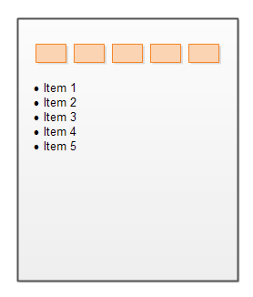
If you have a website that looks like this on a desktop computer monitor:
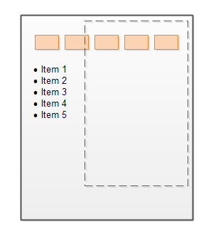
Then it is not very good if the user has to scroll around the website to find the top and left navigation on a mobile device. Here is an illustration of that (the dashed area represents the viewport of a mobile device).
Of course, the horizontal scrolling should be eliminated by a responsive design that adapts the width of the website to the device. The website would then look like this:
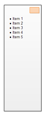
But notice how long the website becomes. This happens when you stack content blocks under each other on a mobile device, which were displayed next to each other horizontally on a desktop device. In order to get to the top menu the user has to scroll a lot vertically, as illustrated here:
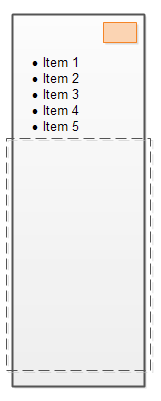
Therefore you should consider keeping the most used menus or menu items in a menu that is always visible on a mobile device. That way the user can easily get to the top menu, no matter where on the page he or she is. Here is a diagram illustrating that:
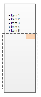
In general the principle that applies is that all actions that are commonly used in the website or app should be easily available from anywhere on the website or app. Not just on the pages somewhere, but from the viewport of the mobile device too.
| Tweet | |
Jakob Jenkov | |


