Mobile Viewable Websites
Jakob Jenkov |
Different Devices - Different Screen Sizes
Mobile devices (smart phones and tablets) have smaller screens than desktop devices. Therefore it is often not possible to show the same amount of information on a mobile screen as on a desktop screen. To be viewable on a mobile device, your website must therefore adapt itself to the smaller screen.
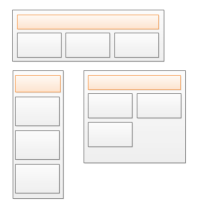
On a mobile device, scrolling horizontally is often very annoying, whereas scrolling vertically is natural. Therefore you should adapt the width of the content to fit within the width of the mobile screen, and let the content grow vertically if necessary. This diagram shows a website with content blocks as it could look on 3 different devices:
To adapt the content of your website to the width of different screen sizes you divide the content into individual blocks, and use the following techniques on these blocks:
- Resizing
- Stacking
- Showing / Hiding
- Moving
- Combinations of above
I will go through each of these techniques in the following sections.
Resizing
The first technique used to adapt the content of a website to the screen width of a device is resizing the content blocks. That means using relative widths instead of absolute widths. Here is a diagram illustrating a set of content blocks with different widths on different devices:
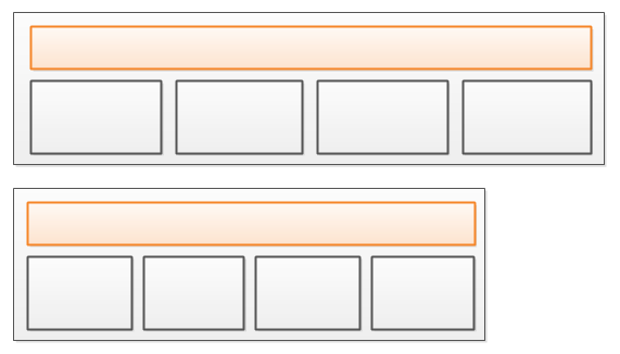
Notice how 4 content blocks are displayed in the width on both screens, but that the content blocks are not as wide on the second screen as on the first screen. The content blocks have been resized to fit the width of the screen.
When resizing content blocks they may sometimes resize in both the width and the height. If a content block contains text and it has its width decreased, some of the text may wrap onto new lines, thus increasing the height of the content block. Since it is easier to scroll vertically than horizontally on a mobile device, this is typically not a problem.
Stacking
Content blocks can usually be resized sensibly within a certain minimum and maximum width, but outside of this minimum and maximum width interval the content blocks are usually too narrow or too wide.
When content blocks gets too narrow, the solution is to stack them on top of each other. Here is a diagram showing 4 content blocks which are first resized (because the screen is smaller), and later stacked when the screen gets even smaller:
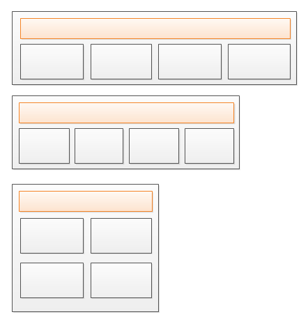
Notice how the content blocks gets wider again when they are stacked 2 by 2. That happens because the screen size allows for wider content blocks when stacked 2 by 2. When the screen size gets narrower, so will the content blocks, until they are so narrow that they must be displayed in a 1 by 4 column (4 blocks stacked on top of each other).
When combining resizing and stacking together, the developer has to determine at what content block width the website is to change from resizing to stacking. This is usually done in terms of screen widths (or browser window widths). These widths are also called "breakpoints". For instance, between 400 and 800 pixels in screen width you will use a 1 by 4 column stacking. Between 800 and 1200 pixels screen width you will use a 2 by 2 column stacking. And finally, above 1200 pixels a 4 by 1 column stacking. 400, 800 and 1200 are "breakpoints" in this example.
Showing / Hiding
There might be content blocks you may want to show or hide depending on the screen width. For instance, on a desktop computer you may have space at the top of the page to display a menu for the website. However, on a mobile device with a smaller screen, you may not be able to show all menu items. Therefore you might want to hide the desktop menu and show a mobile friendly menu instead.
You will use the screen width breakpoints to decide whether to show or hide content blocks too.
Here is a diagram illustrating how the top bar has space for the individual menu items on a wider screen, but has to hide that menu and show a "menu" button instead, which will show the menu items in a mobile friendly version when clicked.
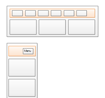
Clicking the "menu" button will show the menu items in a mobile friendly layout. It will not just show the desktop version of the menu.
Moving
Moving content blocks is really just another term for "showing / hiding" content blocks. For instance, on a desktop screen you might prefer to have a floating block of "sign up for news letter / Google+ / vote for this article" etc. to the left of the main content. However, on a mobile device you do not have extra space in the width to spare for that. On a mobile device you might prefer to move that block to the bottom of the page, instead of the left part of the page. Whether you actually move the HTML in the DOM or just show / hide different content blocks is up to you. The final effect is the same to the user (but it may not the be same for Google and SEO).
Combinations of the Above
You will often use combinations of resizing, stacking, showing, hiding and moving in order to arrive at a reasonably responsive web design.
How To Implement This
If you use a responsive web framework like Bootstrap, Ink or Foundation, they will have solution for all of the above which you can use out of the box. I would really recommend that you try a framework before trying to implement your own solution. Frameworks give you a lot for free.
If you want to, or need to, implement your own responsive web design, you need to use CSS Media Queries, and possibly also JavaScript. Getting into exactly how to do that, is outside the scope of this text. This text's purpose is just to introduce you to the techniques themselves, so you know what effect to aim for.
| Tweet | |
Jakob Jenkov | |


