Responsive Images
Jakob Jenkov |
Introduction to Responsive Images
Responsive images means images that can be scaled to fit the content blocks they are displayed in. One core concept of responsive web design is that content blocks can be resized to fit the width of the browser window. While some HTML is naturally scalable, images typically have a fixed width and height and thus represents a challenge to a scalable layout. In this text I explain how to overcome that challenge.
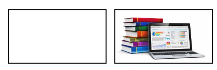
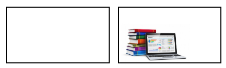
As explained in Mobile Viewable Websites, content in a responsive layout is divided into blocks. These blocks are then resized and/or stacked to make them display nicely on various devices. If a content block contains an image, and the content block is larger than the image, there is no problem. The image is just displayed inside the content block. This diagram illustrates that situation:
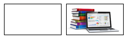
But if the content block is resized to be smaller than the image, the image will normally force the content block
(e.g. a div element) to have the same size as the image. Thus, this situation:
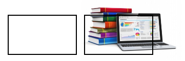
... will normally cause this to happen to the content block:
If your content blocks are expanded by their content, the whole layout may break down. The content blocks may not use the screen correctly in the width, and may not stack correctly.
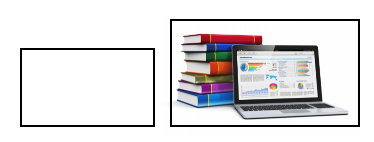
To avoid that, you can set a max-width CSS property on a responsive image. That makes sure that
the image will be scaled down to fit into its content block if the content block is not big enough to hold
the image in its original size. Here is how that is done:
<img src="..." style="max-width:100%" >
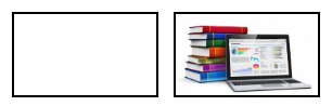
Setting the max-width CSS property to 100% makes sure that the image is never
wider than 100% of its parent element's width. Here is how the resulting content blocks would look
with that CSS property set:
To make sure that all browsers handle the image resizing properly, you should set the height CSS property
of the image to auto, like this:
<img src="..." style="max-width:100%; height:auto;" >
Now the browsers will calculate the height of the resized image based on its width (after resizing), so that the original aspect ratio of the image is preserved.
Scaling a Responsive Image to Fill Its Content Block
In case a content block is larger than the image it contains, you might want to resize the image to fill out its content block, instead of having blank space around the image. To illustrate what I mean, you might want to go from this:
... to this:
To achieve that, you set the width CSS property of the img element to 100%
and the height property to auto. The max-width CSS property is now no longer
necessary. The image will always be scaled to fit inside its parent HTML element regardless of whether the content
block is bigger or smaller than the image. Here is how it is done in code:
<img src="..." style="width:100%; height:auto;" >
Responsive Image CSS Classes
Instead of setting the CSS properties directly in the style attribute of the img
element, you could create a responsive image CSS class. Here is an example:
<style>
    img.responsive {
        width : 100%; /* or max-width : 100% */
        height: auto;
    }
</style>
<img src="..." class="responsive">
Using a responsive image CSS class is probably easier than setting the styles directly in the img
element.
In case you need to sometimes make images always fill out their content box, and sometimes not, you could create two different CSS classes. Here is an example:
<style>

    img.responsive-fill {
        width : 100%;
        height: auto;
    }
    img.responsive-shrink {
        max-width : 100%;
        height: auto;
    }
</style>
<img src="..." class="responsive-fill">
<img src="..." class="responsive-shrink">
This way you can choose from image to image what responsive image scaling strategy to use.
Choosing Responsive Image Dimensions
When you start making images responsive, your images will almost always get scaled either up or down in size. This brings up the question: Should you
- Make images the same width as the smallest possible width of the content blocks, and always have the image scaled up when content blocks are larger than that?
- Make images the same width as the largest possible width of the content blocks, and always have image scaled down when the content blocks are smaller than that.
Making images smaller and have them scaled up has the advantage that smaller images take up less bytes in the image file, and are thus transferred faster to the browser. As mentioned in Fast Loading Websites, this is good for mobile devices with limited bandwidth. The disadvantage is that the image quality will not be as good when the image is scaled up a lot. The user might notice the pixelation happening when the image is scaled up too far from its original size.
Making the images larger and have them scaled down has the advantage that image quality is better when the content blocks are bigger. However, if the content blocks gets much smaller than their max size, a scaled down image may also start to lose quality. The browsers are not scaling the images perfectly. Another disadvantage of bigger images is that they are slower to download.
You could also choose to make images a size that fits with the average content block size
( max width + min width / 2 ). Then the images will have higher quality than the smaller images,
and still be smaller in file size than the larger images.
No matter what strategy you choose for the size of our responsive images, you will end up with a compromise. You will have to experiment with your website or web app to find an acceptable compromise in your specific situation.
Different Images For Different Screen Sizes
Sometimes the difference in content block width between a big screen and a small screen may be so big that simply resizing the images may not work. You may have to choose completely different versions of the images for different screen sizes. You may need a different aspect ratio, to only show part of an image, or to choose a completly different image.
Unfortunately CSS does not (yet) have any way to specify different sources (src="...")
for images depending on screen size. But you can choose the background image of a div
element using CSS, and then combine that with CSS media queries to choose different images as background
images for different screen sizes. Here is a CSS example doing that:
<style>
    #div {
        width: 100%
    }

    @media only screen and (max-width: 600px) {
        #image1 {
            background-image: url("image-small.png");
        }
    }
    @media only screen and (min-width: 601px) and (max-width: 900px) {
        #image1 {
            background-image: url("image-medium.png");
        }
    }
    @media only screen and (min-width: 901px)  {
        #image1 {
            background-image: url("image-large.png");
        }
    }
</style>

...
<div id="image1"></div>
...
As indicated by the elipses (...) the div element with the id
image1 should be located inside a content block somewhere. To keep the above example
short, all unnecessary HTML has been removed.
One disadvantage of the above solution is that you cannot control if the browser downloads one or all of the images referenced in the CSS styles. Ideally the browser should only download one of them, but for optimization reasons the browser may choose to download them all, so the page displays faster later. This is not good for mobile devices with limited bandwidth, as they end up downloading multiple images instead of just one.
A JavaScript Solution
You could also choose to a JavaScript based solution. You could write your responsive image elements like this:
<img src-0="image-small.png" src-1="image-medium.png" src-2="image-large.png" >
You can then scan the HTML page with JavaScript (e.g. with jQuery)
for image elements. Then determine the browser window size, and based on that choose one
of the three attributes src-0, src-1 and src-2 to
copy into the src attribute of the img element. This will trigger
the loading of the corresponding image.
This solution enables you to control what images are downloaded when, so that mobile devices do not download more than one image. The disadvantage is that you need to resort to JavaScript to get the desired effect.
SVG Images
SVG is short for Scalable Vector Graphics (see my SVG tutorial for more info). SVG images can scale up and down in size without losing quality. Thus, it can be an advantage to use SVG images for logos and icons in a website. Thus, the logos and icons can scale up and down in size almost perfectly, regardless of screen size.
If you have your SVG images in separate files, you can include them in your HTML page using the
img element, just like any other image. Here is an example:
<img src="/images/svg/svg-icons-circle-1.svg">
Here is the resulting image when displayed:
Look what happens when I change the width of the img element:
<img src="/images/svg/svg-icons-circle-2.svg" style="width: 32px;">
<img src="/images/svg/svg-icons-circle-2.svg" style="width: 64px;">
<img src="/images/svg/svg-icons-circle-2.svg" style="width: 96px;">
Here is how the images look when drawn:
Notice how the circle is scaled up and down almost perfectly.
For the scaling via the img element to work, the SVG image needs to have
its width, height and viewBox attributes
set inside it. Here is how that looks:
<svg xmlns="http://www.w3.org/2000/svg"
        xmlns:xlink="http://www.w3.org/1999/xlink"
        width="70px" height="70px" viewBox="0 0 70 70">
    <circle cx="40" cy="40" r="24" style="stroke:#006600; fill:#00cc00"/>
</svg>
When setting the width, height and viewBox
property, you tell the browser what part of the virtual canvas to draw. The view box
tells the upper left and lower right corner of the virtual canvas. Thus, if the image
is scaled to a size bigger than that, the whole image is scaled up, instead of just
making the virtual canvas bigger (resulting in white space next to the SVG shapes in the image).
The viewBox property is explained in more detail in my tutorial about
the SVG Viewport and View Box.
Always Set Image Width Via CSS Properties
In all the examples I have shown you in this tutorial, all image widths have been set via
the CSS width property. Do not use the width and height
attributes of the img element. It will not give the desired effect. The browsers
treat these attributes differently than the corresponding CSS properties.
More precisely, this is the right way:
<img src="/images/svg/svg-icons-circle-2.svg" style="width: 32px;">
Whereas this is the wrong way:
<img src="/images/svg/svg-icons-circle-2.svg" width="32px">
Always use the CSS properties - either set directly inside the style attribute of the
img element, or via a CSS class.
| Tweet | |
Jakob Jenkov | |


