JavaFX BarChart
Jakob Jenkov |
The JavaFX BarChart component is capable of drawing a bar chart inside your JavaFX applications. This is useful
in dashboard-like applications. The JavaFX BarChart component is represented by the class
javafx.scene.chart.BarChart
BarChart X Axis and Y Axis
A JavaFX BarChart draws a bar chart. A bar chart is a two-dimensional graph, meaning the graph has an X axis and a Y axis. For bar charts the X axis is typically a category of some kind, and the Y axis is numerical.
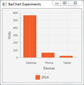
For instance, imagine a bar chart illustrating the number of visits to a website from desktop, phone and tablet users. The bar chart would show 3 bars. The categories on the X axis would be "Desktop", "Phone" and "Tablet". The Y axis would show how many visits each category on the X axis has, so the Y axis is numerical.
You need to define the X axis and Y axis used by a BarChart.
A categorical axis is represented by the JavaFX class javafx.scene.chart.CategoryAxis. A
numerical axis is represented by the JavaFX class javafx.scene.chart.NumberAxis .
Here is an example of creating a JavaFX CategoryAxis and NumberAxis:
CategoryAxis xAxis    = new CategoryAxis();
xAxis.setLabel("Devices");

NumberAxis yAxis = new NumberAxis();
yAxis.setLabel("Visits");
Creating a BarChart
To create a JavaFX BarChart component you must create an instance of the BarChart class.
You must pass an X axis and a Y axis instance to the BarChart constructor.
Here is a JavaFX BarChart instantiation example:
CategoryAxis xAxis    = new CategoryAxis();
xAxis.setLabel("Devices");

NumberAxis yAxis = new NumberAxis();
yAxis.setLabel("Visits");

BarChart     barChart = new BarChart(xAxis, yAxis);
It is possible to display multiple data series in the same bar chart. I will show how to do that later in
this BarChart tutorial.
BarChart Data Series
To get the JavaFX BarChart component to display any bars, you must provide it with a data series.
A data series is a list of data points. Each data point contains an X value and a Y value. Here is an example
of creating a data series and adding it to a BarChart component:
XYChart.Series dataSeries1 = new XYChart.Series();
dataSeries1.setName("2014");

dataSeries1.getData().add(new XYChart.Data("Desktop", 178));
dataSeries1.getData().add(new XYChart.Data("Phone"  , 65));
dataSeries1.getData().add(new XYChart.Data("Tablet"  , 23));


barChart.getData().add(dataSeries1);
First an XYChart.Series instance is created and given a name.
Second, 3 XYChart.Data instances are added to the XYChart.Series object.
Third, the XYChart.Series object is added to a BarChart object.
Adding a BarChart to the Scene Graph
To make a BarChart visible you must add it to the JavaFX scene graph. This means adding the
BarChart to a Scene object, or adding the BarChart object to a
layout component which is added to a Scene object.
Here is an example of adding a JavaFX BarChart to the JavaFX scene graph:
package com.jenkov.javafx.charts;

import javafx.application.Application;
import javafx.scene.Scene;
import javafx.scene.chart.BarChart;
import javafx.scene.chart.CategoryAxis;
import javafx.scene.chart.NumberAxis;
import javafx.scene.chart.XYChart;
import javafx.scene.layout.VBox;
import javafx.stage.Stage;

public class BarChartExperiments extends Application {

    @Override
    public void start(Stage primaryStage) throws Exception {
        primaryStage.setTitle("BarChart Experiments");

        CategoryAxis xAxis    = new CategoryAxis();
        xAxis.setLabel("Devices");

        NumberAxis yAxis = new NumberAxis();
        yAxis.setLabel("Visits");

        BarChart     barChart = new BarChart(xAxis, yAxis);

        XYChart.Series dataSeries1 = new XYChart.Series();
        dataSeries1.setName("2014");

        dataSeries1.getData().add(new XYChart.Data("Desktop", 567));
        dataSeries1.getData().add(new XYChart.Data("Phone"  , 65));
        dataSeries1.getData().add(new XYChart.Data("Tablet"  , 23));

        barChart.getData().add(dataSeries1);

        VBox vbox = new VBox(barChart);

        Scene scene = new Scene(vbox, 400, 200);

        primaryStage.setScene(scene);
        primaryStage.setHeight(300);
        primaryStage.setWidth(1200);

        primaryStage.show();
    }

    public static void main(String[] args) {
        Application.launch(args);
    }
}
The application resulting from running this code example will look similar to this:

Displaying Multiple Data Series in the Same BarChart
As mentioned earlier in this tutorial it is possible to display multiple data series in the same BarChart
component. You do so simply by adding multiple data series to the BarChart component.
When displaying multiple data series in the same BarChart, the data points are categorized by their
X values (category). Thus, all data points across the different data series with the same X value will displayed
next to each other in the bar chart. Here is first an example of creating two data series with data points
that have the same X value (category):
XYChart.Series dataSeries1 = new XYChart.Series();
dataSeries1.setName("2014");

dataSeries1.getData().add(new XYChart.Data("Desktop", 567));
dataSeries1.getData().add(new XYChart.Data("Phone"  , 65));
dataSeries1.getData().add(new XYChart.Data("Tablet"  , 23));

barChart.getData().add(dataSeries1);

XYChart.Series dataSeries2 = new XYChart.Series();
dataSeries2.setName("2015");

dataSeries2.getData().add(new XYChart.Data("Desktop", 540));
dataSeries2.getData().add(new XYChart.Data("Phone"  , 120));
dataSeries2.getData().add(new XYChart.Data("Tablet"  , 36));

barChart.getData().add(dataSeries2);
Notice how the XYChart.Data instances in the two data series use the same three values for X
("Desktop", "Phone" and "Tablet").
Here is a full example showing the two data series added to the BarChart and displayed in the
scene graph:
package com.jenkov.javafx.charts;

import javafx.application.Application;
import javafx.scene.Scene;
import javafx.scene.chart.BarChart;
import javafx.scene.chart.CategoryAxis;
import javafx.scene.chart.NumberAxis;
import javafx.scene.chart.XYChart;
import javafx.scene.layout.VBox;
import javafx.stage.Stage;

public class BarChartExperiments extends Application {

    @Override
    public void start(Stage primaryStage) throws Exception {
        primaryStage.setTitle("BarChart Experiments");


        CategoryAxis xAxis    = new CategoryAxis();
        xAxis.setLabel("Devices");

        NumberAxis yAxis = new NumberAxis();
        yAxis.setLabel("Visits");

        BarChart     barChart = new BarChart(xAxis, yAxis);

        XYChart.Series dataSeries1 = new XYChart.Series();
        dataSeries1.setName("2014");

        dataSeries1.getData().add(new XYChart.Data("Desktop", 567));
        dataSeries1.getData().add(new XYChart.Data("Phone"  , 65));
        dataSeries1.getData().add(new XYChart.Data("Tablet"  , 23));

        barChart.getData().add(dataSeries1);

        XYChart.Series dataSeries2 = new XYChart.Series();
        dataSeries2.setName("2015");

        dataSeries2.getData().add(new XYChart.Data("Desktop", 540));
        dataSeries2.getData().add(new XYChart.Data("Phone"  , 120));
        dataSeries2.getData().add(new XYChart.Data("Tablet"  , 36));

        barChart.getData().add(dataSeries2);

        VBox vbox = new VBox(barChart);

        Scene scene = new Scene(vbox, 400, 200);

        primaryStage.setScene(scene);
        primaryStage.setHeight(300);
        primaryStage.setWidth(1200);

        primaryStage.show();

    }

    public static void main(String[] args) {
        Application.launch(args);
    }
}
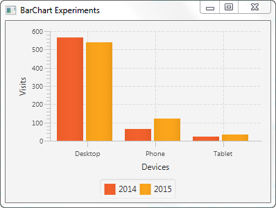
The application resulting from running this example would look similar to this:

Notice how data from the two different data series are mixed. The data points with the X value "Desktop" are displayed next to each other, and the same is true for the data points with the X values "Phone" and "Tablet".
| Tweet | |
Jakob Jenkov | |


