JavaFX HBox
Jakob Jenkov |
The JavaFX HBox component is a layout component which positions all its child nodes (components) in a horizontal
row. The Java HBox component is represented by the class javafx.scene.layout.HBox .
Create an HBox
You create an HBox using its constructor like this:
HBox hbox = new HBox();
HBox also has a constructor which takes a variable length list of components it should layout.
Here is an example of how to do that:
Button button1 = new Button("Button Number 1");
Button button2 = new Button("Button Number 2");

HBox hbox = new HBox(button1, button2);
This HBox example will layout the two Button instances next to each other
in a horizontal row.
Adding an HBox to the Scene Graph
For an HBox to be visible it must be added to the scene graph.
This means adding it to a
Scene object, or as child of a layout which is attached to a Scene object.
Here is an example that attaches a JavaFX HBox with the two Button instances
to the scene graph:
package com.jenkov.javafx.layouts;

import javafx.application.Application;
import javafx.scene.Scene;
import javafx.scene.control.Button;
import javafx.scene.layout.HBox;
import javafx.stage.Stage;

public class HBoxExperiments extends Application  {

  @Override
  public void start(Stage primaryStage)
    throws Exception {

    primaryStage.setTitle("HBox Experiment 1");

    Button button1 = new Button("Button Number 1");
    Button button2 = new Button("Button Number 2");

    HBox hbox = new HBox(button1, button2);

    Scene scene = new Scene(hbox, 200, 100);
    primaryStage.setScene(scene);
    primaryStage.show();
  }

  public static void main(String[] args) {
    Application.launch(args);
  }
}
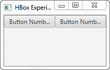
The result of running the above JavaFX HBox example is an application that looks like this:

Notice that the two Button controls are kept on the same horizontal row even if there is not
enough space to show them in their fully preferred widths. The buttons do not "wrap" down on the next line.
Child Node Spacing
In the earlier example the HBox positioned the nodes (button controls) right next to each other.
You can make the HBox insert some space between its nested controls by providing the space in
the HBox constructor. Here is an example of setting the space between nested controls in an
HBox:
HBox hbox = new HBox(20, button1, button2);
This example sets the spacing between the controls in the HBox layout component to 20.
You can also set the space between the nested controls using the setSpacing() meethod, like this:
hbox.setSpacing(50);
This example will set the spacing between nested controls to 50.
Child Node Margin
You can set the margin for child nodes of a JavaFX HBox using the static setMargin() method.
Here is an example of setting the margin around a JavaFX Button using the
setMargin() method:
Button button1   = new Button("Button 1");

HBox hbox = new HBox(button1);

HBox.setMargin(button1, new Insets(10, 10, 10, 10));
This example sets the margin around the Button inside the HBox to 10 on each side.
Child Node Alignment
Since the JavaFX HBox is a container component, meaning it contains other JavaFX components, you can specify
how the HBox is to align the components it contains. You do so via the HBox setAlignment() method.
Here is an example of setting the alignment of child nodes for a JavaFX HBox:
hbox.setAlignment(Pos.BASELINE_CENTER);
This example will make the HBox position its child nodes along the baseline (vertically) of the vertical line, and from the center of the line and out (horizontally).
The JavaFX VBox control supports the following alignment options:
| Parameter | Vertically | Horizontally |
|---|---|---|
| Pos.BASELINE_LEFT | Baseline | Left |
| Pos.BASELINE_CENTER | Baseline | Center |
| Pos.BASELINE_RIGHT | Baseline | Right |
| Pos.BOTTOM_LEFT | Bottom | Left |
| Pos.BOTTOM_CENTER | Bottom | Center |
| Pos.BOTTOM_RIGHT | Bottom | Right |
| Pos.CENTER_LEFT | Center | Left |
| Pos.CENTER | Center | Center |
| Pos.CENTER_RIGHT | Center | Right |
| Pos.TOP_LEFT | Top | Left |
| Pos.TOP_CENTER | Top | Center |
| Pos.TOP_RIGHT | Top | Right |
Child Node hgrow
You can specify whether a child node of an HBox should grow horizontally to fill any available space available inside
the HBox. You do so via the HBox setHgrow() static method. You have to specify which child node the rule is set
for. You do so by passing the child node as parameter to setHgrow(). You also have to pass the
horizontal expansion policy as parameter to setHgrow(). Here is an example of telling that a child Button
to expand horizontally if space is available inside the HBox:
Button button1   = new Button("Button 1");

HBox hbox = new HBox(button1);

HBox.setHgrow(button1, Priority.ALWAYS);
The Priority class contains the following constants you can use to set the expansion policy:
- Policy.ALWAYS
- Policy.SOMETIMES
- Policy.NEVER
Please keep in mind that the HBox will only have extra horizontal space available if the HBox is wider than the sum of the preferred widths of its children.
HBox Preferred Height
The default preferred height of an HBox is set to the same value as the largest preferred height of any of its child nodes.
fillHeight
The JavaFX HBox fillHeight property can be used to tell the HBox control whether it should
expand the height of its children to fill out the whole height of the HBox, or keep its children at their
preferred heights.
The fillHeight property only affects child components which heights can actually change.
For instance, a Button does not change its height by default. It's max height is set to its preferred height.
However, you can override that by setting the max height of the Button, or any other component you want
to nest inside the HBox, to a value different than its preferred value.
Here is an example showing how the fillHeight property works:
Button button1   = new Button("Button 1");
button1.setMaxHeight(99999.0D); //or Double.MAX_VALUE;

HBox hbox = new HBox(button1);

hbox.setFillHeight(true);
| Tweet | |
Jakob Jenkov | |


